Digital insurance

image of the project

Case study

WebApp FinTech SaaS B2B
Project description

The goal of this project was to design a user-friendly experience that unified several new insurance products into a single journey, enabling both new and existing customers to secure comprehensive business coverage in one visit.

In the long term, the project served as a proof of concept for a platform-wide overhaul. The intent was to create a more intuitive, scalable experience across industries while strengthening customer confidence in both the platform and their coverage.

Overview

This case study will dive deep into a large-scale project, spanning over a year in development and iteration and involving a large group of experts in the field of product design, ux research, analytics, engineering, insurance, sales, marketing and compliance.

Client

Embroker is a digital-first business insurance company with a mission to simplify a traditionally complex industry. Their online platform helps businesses easily compare, purchase, and manage tailored insurance policies, combining advanced technology with expert guidance.

Responsibilities

Design, Wireframing, Prototyping, Usability testing

Team

3 designers,
20 developers,
multiple teams containing SMEs in various areas

Role

UX design and research

Context

The company identified that its largest sales portion was coming from a single industry and moved toward creating a more in-depth, comprehensive coverage plan. With the help of marketing and insurance experts, the needs of these companies were identified, and additional coverage options were introduced to fill the gap for this customer base.

The company's platform for the sale and management of user policies had gaps in its user experience and previously identified pain points. The new product needs and experience updates were merged into a large-scale project that later became the company's best-selling product.

Research
Leveraging SMEs, heuristic analyses and competitive research.

Without a budget approved for usability testing, we relied on the knowledge of our customer support and sales teams to learn the needs and pain points of our users.

Three 30-minute workshops were conducted between the product and design teams and the SMEs in order to pinpoint the largest issues users encountered when interacting with the platform as well as insurance as a whole. This, in combination with previously conducted heuristic analyses and an attorney user persona, gave us a good idea of what to focus on and how to move forward.

More competitive research was continuously conducted throughout the design stage of the project, involving product selection, application process, and checkout process industry standards and best practices.

Planning

Given the scope of the project and the number of people involved, the company organized a Big Room Planning event. A three-day conference involving all the key teams whose involvement would be necessary for project success.

Two new insurance products, as well as a general project plan, were presented by the insurance and product teams, after which detailed, moderated discussions were held to allow for product, design, and development to ask questions and raise potential concerns.

Design & ideation
Wireframing the flow

With a great starting point to launch the project, the design team, consisting of three designers, separated the project into three main points: product selection, application process, and quoting and checkout. With regular check-ins and design reviews, we were able to focus on more in-depth problem-solving while still ensuring the user flow as a whole remained consistent.

Through conversations with stakeholders and by addressing feasibility with the developers, given a relatively short MVP launch deadline of around 4 months, the final wireframe was presented and agreed upon.

wireflame flow
Streamlining the process
Decision fatigue at product selection

A future iteration would filter products by user industry, helping to address decision fatigue. Product cards would also be updated to contain more relevant content to help users understand what the coverage was offering and how it might be relevant to their business.

But for the MVP, we decided to funnel all users who identified as attorneys to a special page offering products relevant to their industry, ensuring they could easily stay on task and move forward with the application they needed.

Before all coverages
After all coverages
estimated premium
Area of focus
Long application process that could end in no quote

While conducting a heuristics analysis, we discovered that every user would be instructed to go through the entire application, which, depending on their history, could contain around 50 questions, and reach the end of the flow, landing on a page showing no quote and a message indicating that an insurance expert would review their application. This message would be displayed to users regardless of whether they were a good fit for insurance or not.

So, we decided to rearrange the questionnaire to put the eligibility questions first and stop the application process as soon as we determined they wouldn't be quoted.

Next, we would address the more complex cases. Those that could be quoted after a manual process was completed. And, of course, we addressed the details of the happy path.

Area of focus
Users aren't told when they've been declined for coverage

The process for declined and referred (requiring a manual process) users looked the same. Both would reach an “empty” quote page, with no price or detailed information, and be told that someone would reach out in a certain amount of time.

This not only gave users the wrong impression but left the company insurance experts with an obligation to reach out to users they may not have needed to if the system was equipped to auto-decline users. So we decided to add this into the process to set the right expectations for users and lighten the load of our colleagues down the line.

quote page
price-bar-sect
Area of focus
User cost concerns

During the SME interviews, we learned that a great deal of users often asked about the price of the coverage they were applying for. So we decided to implement a dynamic price display that would update with every step of the application process and observe how users would react knowing how their history impacts their coverage.

Due to the concerns raised with this approach, it was decided to turn this experiment into an A/B test and see how each flow was received by users.

Prototyping
With the largest problems in the user journey addressed, we moved forward to the design and prototyping stage.

The project included a major system overhaul, which involved new components as well as a lot of development to support the new system changes.

During a two-week sprint, the design team prepared and shared the high-fidelity designs with the development teams for feedback. Some feasibility concerns were discussed, and we reached a mutual agreement on what would be presented and shared with the stakeholders.

Due to the large impact of the project, we decided to build an interactive, high-fidelity prototype to share with the stakeholders after the initial project presentation so they could get a better idea of how the application flow would work from start to finish. This approach helped stakeholders visualize what would happen in both the happy path as well as the longer flows that included several scenarios for users who might experience “hiccups” in the flow, such as being declined or having to answer extra questions due to a more complex insurance history.

Next steps
Development and testing

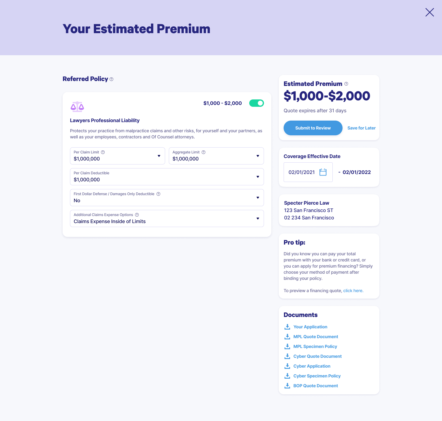
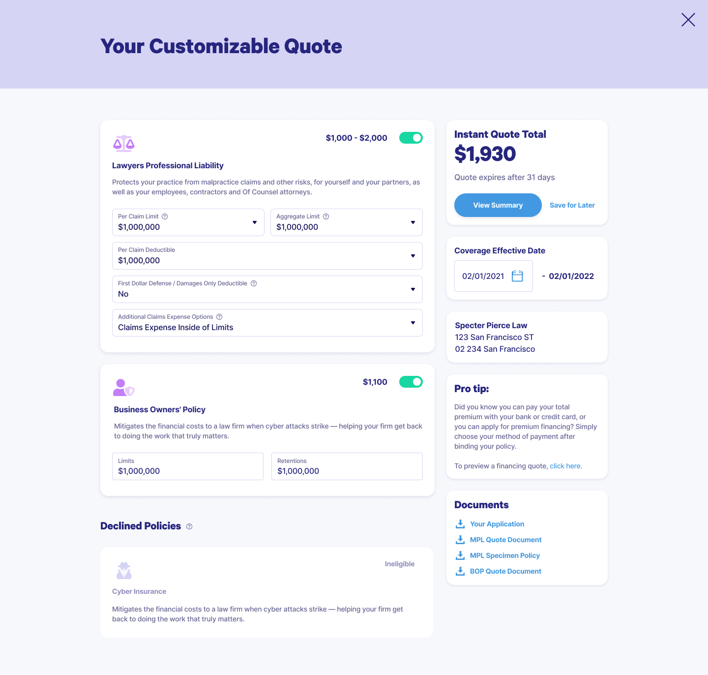
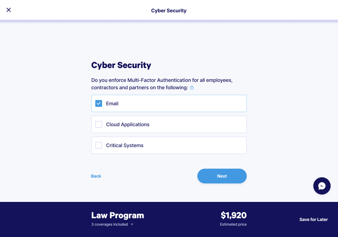
The initial testing phase involved the prototype, which revealed a few compliance-related issues. Those were addressed quickly, and after another review with the development team, we were ready for development.

During the development process, the design team made sure to be present whenever the developers needed our involvement during their grooming sessions, as well as ensuring we were available for any and all questions. As it often happens, a few smaller feasibility issues were uncovered during the development stage but were addressed quickly before the development moved on.

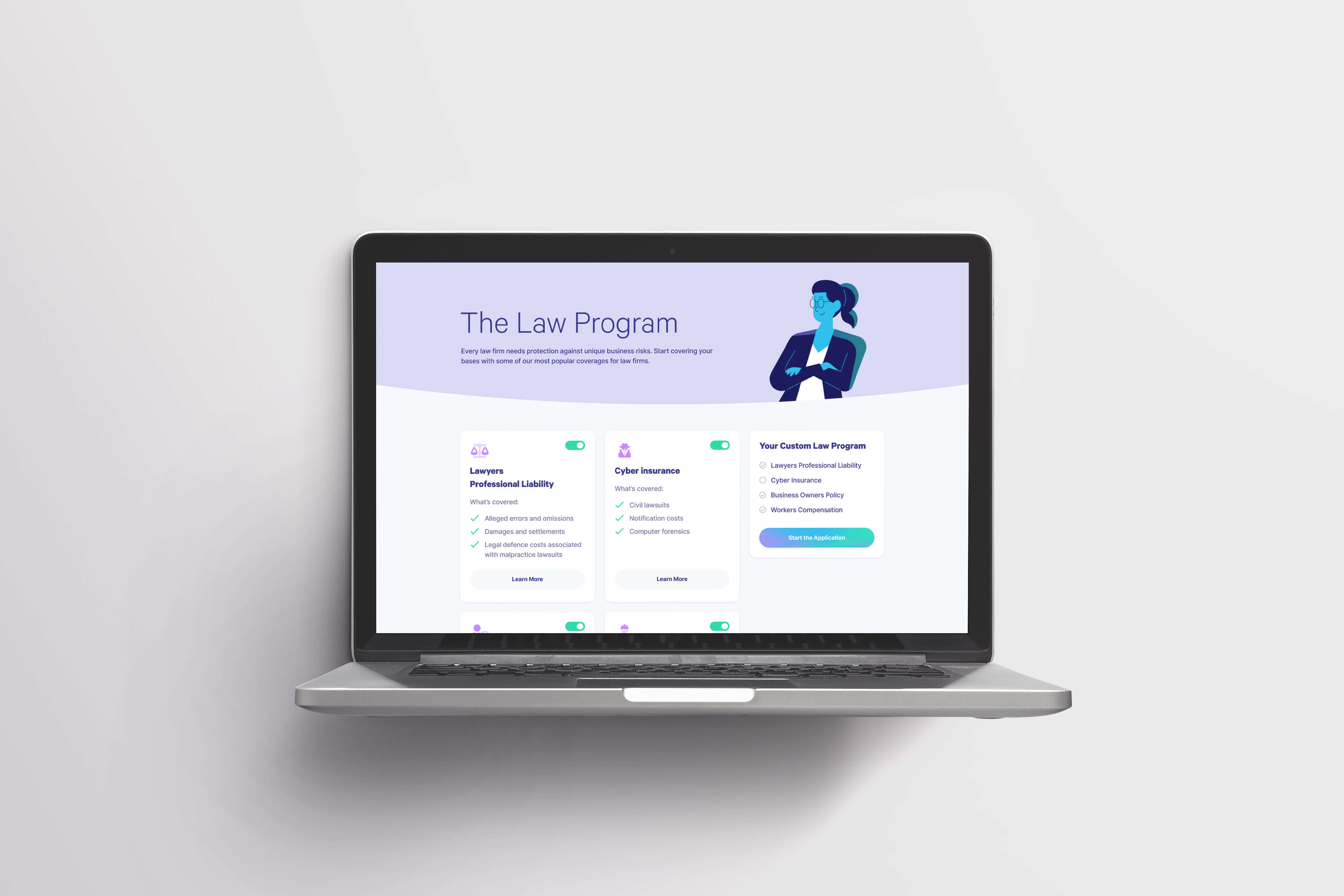
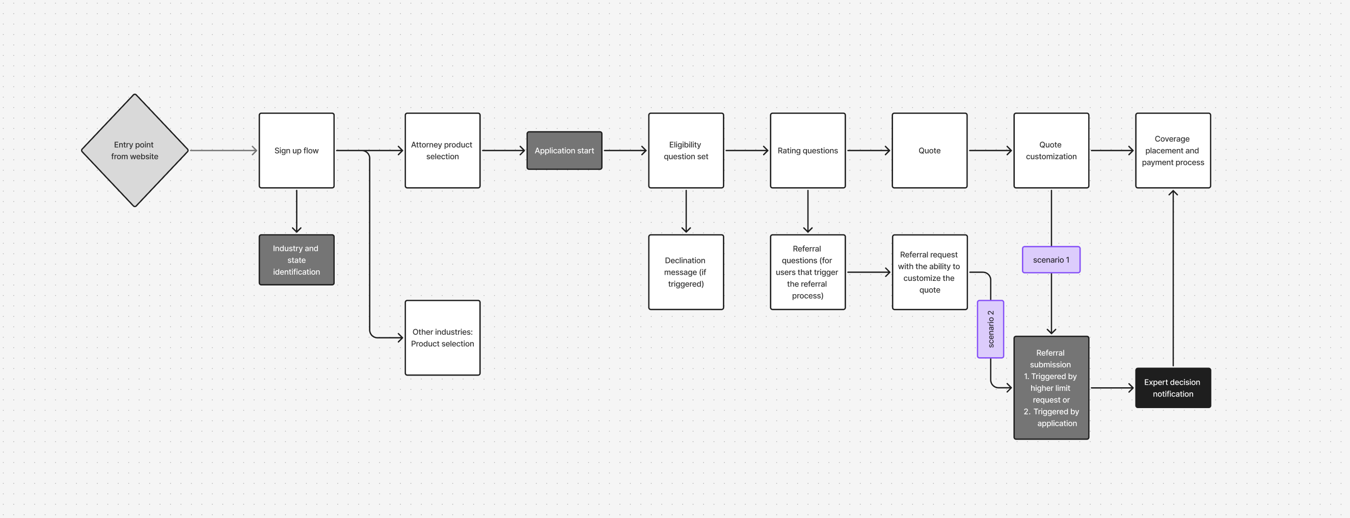
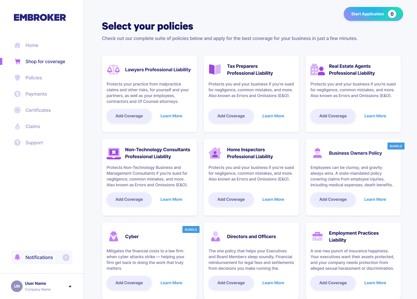
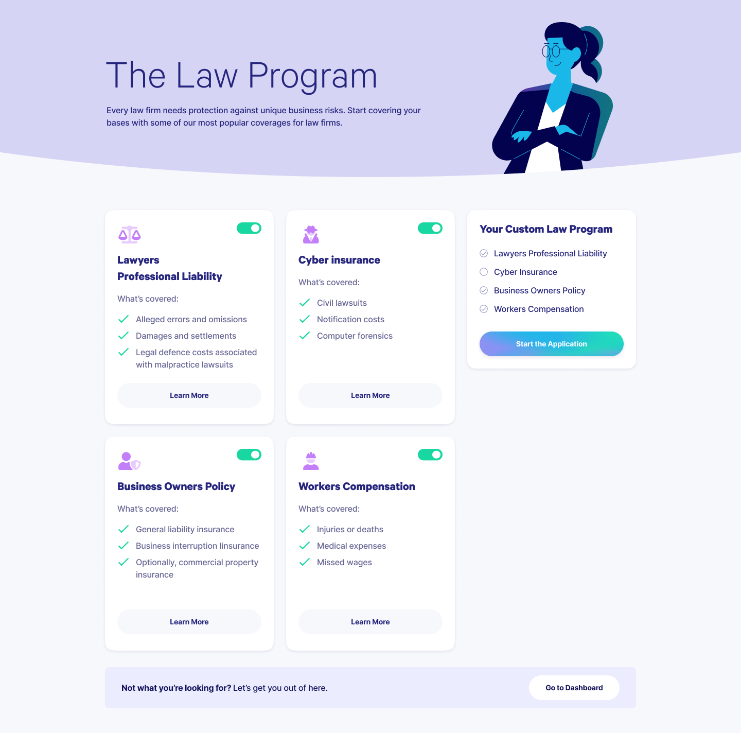
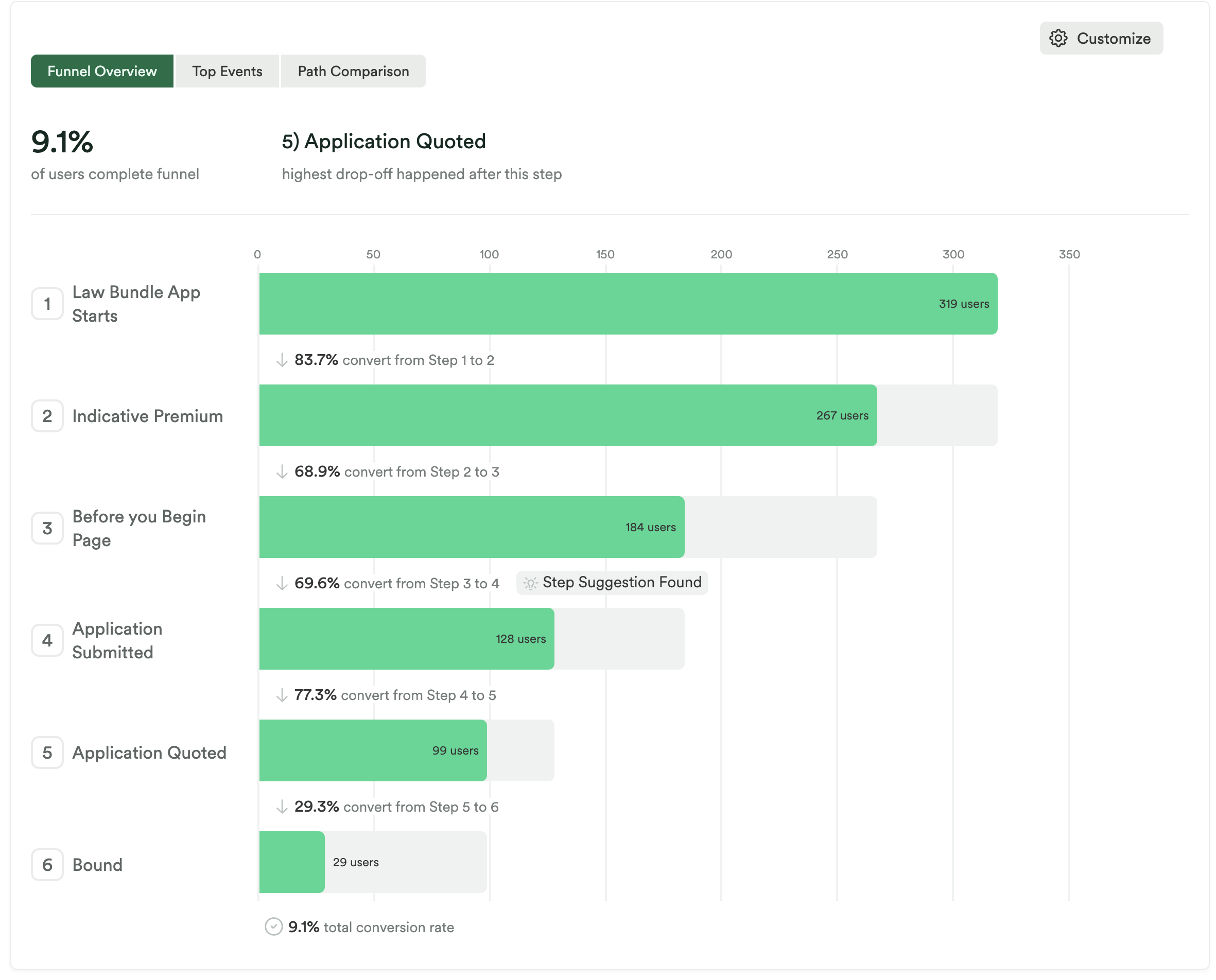
Without a budget for user testing, we made do with a comprehensive UAT stage where testers (representatives from all teams involved in the project) were asked to go over four different scenarios and test the flow in detail. Users were asked to keep an eye on any and all issues that might arise and to attempt to break the build if possible, while keeping track of how the steps they took could be recreated. They were also asked to record their screens while testing the build.

After two weeks of testing, the development team addressed any bugs that arose as a result of the UAT. Following another round of testing, the project was launched.

hand on keyboard
funnel

Launch

Four months since the big room planning, the MVP was launched. The project involved a special offer of two products for the law industry and went on to become the company's most successful product.

Overall the net impact of the enhanced law experience has meaningfully contributed to: policies per customer in law vertical increasing from under 1 in January to over 1.4 by July, premium per customer continues to climb, zero touch producer interactions per customer increased from 47.5% in 4Q23 to 51% in 2Q24.

Later iterations improved on the initial project, addressed issues, and added two more products to the flow.

Later iterations
"Before you begin..."

A screen implemented with the intent to prepare users for the intense application process turned out to do more harm than good. It showed that approximately 24% of users would abandon the process after seeing this screen.

User interviews confirmed that users found the amount of documentation needed to successfully complete the application in a single sitting to be intimidating and that it would likely deter them from moving forward.

Removal of the “before you begin” page increased application submissions by 17% by simplifying the process and removing off-putting information.

hand on keyboard
hand on keyboard
Later iterations
Dynamic pricing

A screen implemented with the intent to prepare users for the intense application process turned out to do more harm than good. It showed that approximately 24% of users would abandon the process after seeing this screen.

The A/B test confirmed a higher rate of users completing the application process if the price wasn't visible on the screen at all times.

As a result, the fluctuating price was removed, and we began work on improving the “price estimate” for users who did not follow the happy path. The submission rate for the law bundle in the period before was ~56% and after is ~64%.

Later iterations
Balancing agency and decision paralysis

A large drop-off was discovered in the quote section itself, even for quoted users. Usability testing revealed that users found the customization options confusing and overwhelming, partly due to the use of "insurance lingo," which many users were unfamiliar with.

This led to a new project that would focus on research, experimentation, and further testing of quote flows in order to find the right balance between giving users agency and not overwhelming them.

hand on keyboard
Projects
image of the project
Document repository

An application that creates, stores, and tracks contracts and agreements.

WebApp HRTech DMS Internal Tool
image of the project
Ankh app

An application that helps users record and store their thoughts and memories.

MobileApp Digital Legacy B2C Data Security